Wednesday, February 17, 2010

You Can't Miss: The Ride Journal


The Ride Journal.
A new independent magazine.
Yes, you can't miss it. You must check it out.
The Ride Journal is a collection of personal stories of how bike changed people's lives. The magazine DOES NOT feature products or recap races but gets to the heart of bicycling. The visual style is crisp and bold but very artistic. There is a great mix of amazing photography and colorful, stylistic illustrations to compliment the heart-felt stories. Three issues have been printed; The journal is based in the UK.


I'd love to post all of the amazing spreads from issue one, but that would deprive you experiencing the magazine for yourself. Check out theridejournal and download the first issue....FOR FREE!

Response: Historical Design Perspective

The purpose of the historical design project was to research an era of a magazine and critique its design. I selected McCall in the 1960s. It was interesting to look at the history of the magazine and put it into context. I was the only person to look at McCalls, but there was another one of the "Seven Sisters" presented. Ladies Home Journal was competition for McCalls.

Vogue in the 30s, 40s, 50s and 60s were all represented during the presentations. That was neat to how the magazine's design changed over the those forty years. Not only do current design trends affect the visual style of the magazine, but the changing hands from editor to editor really affect the look.

Here are a couple images from McCalls to note. McCalls used a lot of illustration with fiction pieces, fun full-page fashion photos, and played with typography that was incorporated into images.

Critique: Designs in Progress

I have three big projects on the front burner. I've been sketching layouts for my prototype for the publishing group, logos for she-who-must-not-be-named, and gearing up for a feature for Vox (feature meeting Friday – I'm so excited!). Because these items are a bit hush-hush right now, no related photos.

While working on my designs, I've been watching while the Olympics. I absolutely love the winter Olympics. And as I've been working on my designs, I've checked out a couple logo blogs for some tips and inspiration. In the Olympic spirit, I'll share the recently announced logo for the 2014 Olympic in Sochi, Russia. Photo courtesy of logodesignlove.com

These are a few of my favorite rings.

Wednesday, February 10, 2010

You Can't Miss: WIRED

The US and UK issue of WIRED are extremely similar. See:

magCulture had an interesting critique of both covers. The US version, as you can see, is a rough, muscular hand with the wrench and the wood background. This is really iconic of the Industrial Revolution. The UK version on the other hand (no pun intended) calls back to Russian constructivism. Apparently, magazines with international versions share similar content frequently, but rarely is the feature story presented on the cover in such a similar way.

This is a good example of how content driven design is influenced by the context in which it is created and presented. What if the US version looked like the UK version and vice versa? There would have been less impact on both parts. The American idea of revolution is vastly different from the European idea.

p.s. magCulture noted that UK Wired doesn't jump stories to back of the book. Interesting.

Response: Noteworthy Typefaces


Typefaces are inspiring. The documentary "Helvetica" was very interesting. So many designers professed their love for Helvetica, and many others expressed their disdain. It is fascinating how typefaces can carry a feeling with them and how people have different perceptions of a typeface.

Throughout the film I kept thinking about Comic Sans. Ugh. Need I say more? That is an overused typeface. It was originally designed for comic-like speech bubbles. Now, it has take over the world and many intra-office memos that should instantly be shredded due to poor typographic choice. There is even a website dedicated to the demise of Comic Sans http://bancomicsans.com/ . Oh, and Papyrus...the typeface of 90s youth ministers everywhere. I feel like there should be a food-pyramid of typefaces. Helvetica, Times and Arno Pro (a personal favorite) would be at the base, other serif and sans serifs would occupy the portions of the pyramid in the middle, typefaces with a small amount of frills would go on the third tier, and Comics Sans, Papyrus, etc the top – use sparingly.

I absolutely loved in the "Helvetica" when one designer said that typefaces are his friends. That is a very profound statement masked by the shear goofiness of the statement. People have a relationship with the type they read. The right type can bring a reader in, the wrong one can steer him or her away.

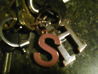
In the photo: my keys. Helvetica perhaps?!

Critique: Cover for Barber Shop Feature


This past week my cover group was up for art selection by the editors. The cover story was about the tradition of barber shops that has been kept alive in Columbia. A few of the shops opened back in the 40s, and barber shops have a nostalgia of back-in-the-day. Images that come to mind are Downtown Disney (and Main Street USA), Hello Dolly and TV Land. I wanted to convey this feel of tradition through images that were nostalgic and reminiscent of that time. I feel good about my design. The colors are bold and it is a little kitschy, and it goes well with the character of Vox Magazine.

I believe every designer has his or her own style. My designs are typically more playful, delicate and sweet. Back in Oklahoma, my mom has an old boot box filled with drawings from when I was a child. There is a drawing I did for LTC (Leaderships Training for Christ) of Shadrach, Meshach and Abednego in the fiery furnace. I was in 5th grade when I drew the scraggly men with my colored pencils. The furnace and men are smack in the middle of an 8.5x11 sheet of paper – white space all around. My mom loves it because she says, "it's charming."

Vox is snarky, not charming. My designs are charming.

The design is about the story – content driven design. My challenge for myself is to push the envelope and take on the Vox voice in my design while creating content driven designs. As I work on future designs for Vox I intend to be in a dialogue with the editors and writers working on the story so that the design and can have a stronger concept. It's easy to stick with designs that are familiar. I need to put a little sass in my sweet.

Wednesday, February 3, 2010

Response: There is a first time for everything

As the saying goes, there is a first time for everything. This past weekend was my first time to design my department for Vox. I design Short Talk – a front of book department that cover a range of topics each week.

Learning PlanSystem was easy; it was really helpful to go over that in class so that it wasn't over whelming when I went to pick up materials. I originally planned on taking the design elements on a jump drive and working from home, but seeing as the magazine office operate with CS4 and I am still on CS3, I figured it would be best not to change the format of the page file.

The change of plan ended up working out really well for me. I work in the mag office on Saturday. Nobody was there, and I was able to focus on my department without distractions from home. Plus, I was able to get a true estimate of the amount of time designing my department would take.

The department pages are due on Sunday; designers have to sit down with the art directors and go through the pages to make sure everything fits the style guide. The art directors are very helpful. This was a great first time department designing experience for me!

Critique: Assignment 2 - Spring Preview

My body will not allow me to stay awake all night. That's too bad because the second page of my spring preview needed me to.

The concept of my cover and spread was the changing of season, the foliage that people look forward to and the events that pop up in the springtime. I showed that change in a non-traditonal way by dividing an illustration of a dogwood, Missouri's state tree, into a grid and then showing the progression of the season change in the different squares. The three spreads were to each contain an image of the tree showing what it would look like at that time of the year.

I feel like the concept was strong but needed to be more tied to content. Yes, it is the spring preview, but the feature is more than just saying "hey, it's spring!" The weakest part of my design was the right page of the feature spread. It is difficult to organize all of that information and make it fit. I was noble in my efforts to not cut content despite the fact that it was dummy text. Boy was it tempting.

As I complete each assignment, I'm making revisions and addressing the problem areas in my design. Designs from my first two assignments may not have ran in Vox, but I've gained some insight into what works and what doesn't for the publication as well as what is feasible for the turn-around time I have for a design piece.

You Can't Miss: The iPad

The biggest news in technology and magazine publishing last week was certainly the announcement of the iPad. It is so revolutionary that you can't miss it. If you didn't hear about the product last week you must be living under a rock ... or working painstakingly on a design. magCulture.com posted a couple things regarding the iPad (check it out here: http://magculture.com/blog/?p=5490 ).

When the iPhone was released, news organizations all of a sudden had a new platform to disseminate information. Programmers and journalists joined forces to create apps that would gain revenue, share content and so much more. Now that the iPad is here, magazine and newspapers have a new platform that would create a similar viewing experience to the traditional print format.

The journalism school offers a course in iPhone app development, and I am currently taking the course. Teams will be comprised of computer science/information technology students and journalism students. Each team will be assigned a client to develop and create an app for. The instructors are finalizing clients for the course and two of the potential clients are The Columbia Missourian and Vox Magazine.

This class deals with iPhone app development, but the news of the iPad has sparked interest and curiosity of the instructors as well as the students – the iPad has the same interface as the iPhone and the programming for the two is very similar. It is interesting and exciting to see how quickly people get their hands on new technology in order to utilize it to its full extent. What I can't wait to see is how design changes to fit the iPad.